Art direction
Meridian
A poster series and visual language for a design conference about slowness, built from oversized letterforms.
- Client
- Meridian Conference
- Year
- 2025
- Role
- Art direction
- Services
- Identity, posters, signage
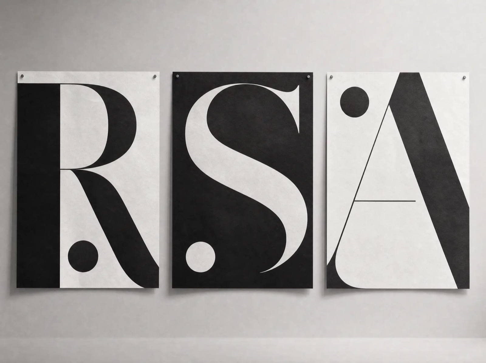
Meridian is a one-day conference about working slower and shipping better. The organizers wanted a visual language that felt like the argument itself: unhurried, confident, impossible to skim past.
Letterforms at building scale
The system is built from single serif characters enlarged until they become landscape — cropped, rotated, and paired with small, precise captions. No photography, no illustration; the type carries everything.
Across posters, badges, and stage screens, the same rules hold: one letter, one caption, one accent. The restraint made the series instantly recognizable around the city.
The result
The conference sold out three weeks early, and the poster series was picked up by two design annuals.